Scotty2Hotty Posted March 16 Share Posted March 16 Football tops can cause a lot of debate but end of the day, doesn't really matter what it looks like as long as we are successful on the pitch. There's always that question over whether it should be traditional, old school, plain but effective sort of top or a more creative and exciting design thats a bit more out there. Obviously the home top is more the latter but feel they could of done this better than they have done here as the whole pattern has just confused people as to what it's meant to be which is not really the object of what I presume Adidas were going for, bit of an own goal. Why not just keep it more like the euro 96 top and this would of been probably one of the best ever tops Scotland has created! Quote Link to comment Share on other sites More sharing options...
DesiScotsman Posted March 16 Share Posted March 16 (edited) On 3/15/2024 at 8:58 AM, Mark Mcp said: Does anyone know if any JD stores does the shirt print on the away top? Tried to order it online but got refunded saying the item was unavailable? Ta Yeah they do printing in-store. I got my away top & Euro badges printed at the JD Sports store at Fort Kinnaird Edinburgh Edited March 16 by DesiScotsman Quote Link to comment Share on other sites More sharing options...
TDYER63 Posted March 17 Share Posted March 17 23 hours ago, McTeeko said: Just noticed the one I bought is ‘slim fit’. Are they all like that or is there an option for ‘regular fit’? Hope you are prepared to pay for 2 bus seats fatty. Quote Link to comment Share on other sites More sharing options...
Ally Bongo Posted March 18 Share Posted March 18 The new England strip emphasises how shite ours is Quote Link to comment Share on other sites More sharing options...
The Black Bra Posted March 18 Share Posted March 18 5 minutes ago, Ally Bongo said: The new England strip emphasises how shite ours is Really? Any idea what the England fan’s reaction is? If we get through the group stage wearing that new shirt it will be a massive seller regardless of how pish people think it is. Quote Link to comment Share on other sites More sharing options...
Ally Bongo Posted March 18 Share Posted March 18 (edited) 2 hours ago, The Black Bra said: Really? Any idea what the England fan’s reaction is? If we get through the group stage wearing that new shirt it will be a massive seller regardless of how pish people think it is. The reaction to the away top is divided - a bit like us to our home top General consensus that their home top is a classic The collar and piping on it makes ours look even shittier We can't even get a white away top to look as good as that Edited March 18 by Ally Bongo Quote Link to comment Share on other sites More sharing options...
Bristolhibby Posted March 19 Share Posted March 19 10 hours ago, Ally Bongo said: The reaction to the away top is divided - a bit like us to our home top General consensus that their home top is a classic The collar and piping on it makes ours look even shittier We can't even get a white away top to look as good as that Not sure where the purple comes into it for England. Bit like us I guess. (Purple Scotland flag on the away shirt, WTF?). Fans are just fickle, England fans will want plane white for home and red for away. Something different and they go nuts. If we get out of the groups it will sell like hotcakes and come an instant classic (remember the McFadden away shirt, hated on here). J Quote Link to comment Share on other sites More sharing options...
todd Posted March 19 Share Posted March 19 12 hours ago, Ally Bongo said: The new England strip emphasises how shite ours is Ours looks like a nice training top, theirs looks like a nice T shirt. Neither are classics as far as I'm concerned Quote Link to comment Share on other sites More sharing options...
Orraloon Posted March 19 Share Posted March 19 Are we going to watch a game of football or a fashion show? Quote Link to comment Share on other sites More sharing options...
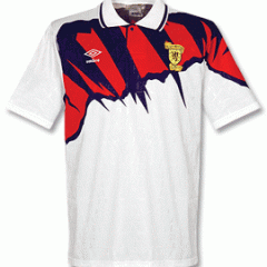
The Black Bra Posted March 19 Share Posted March 19 Always liked the McFadden/Paris away top, and this one: Quote Link to comment Share on other sites More sharing options...
adamntg Posted March 19 Share Posted March 19 On 3/16/2024 at 8:52 PM, Scotty2Hotty said: Football tops can cause a lot of debate but end of the day, doesn't really matter what it looks like as long as we are successful on the pitch. There's always that question over whether it should be traditional, old school, plain but effective sort of top or a more creative and exciting design thats a bit more out there. Obviously the home top is more the latter but feel they could of done this better than they have done here as the whole pattern has just confused people as to what it's meant to be which is not really the object of what I presume Adidas were going for, bit of an own goal. Why not just keep it more like the euro 96 top and this would have been probably one of the best ever tops Scotland has created! I assumed the home top was a tribute to OMD’s classic 1981 album Architecture and Morality. Quote Link to comment Share on other sites More sharing options...
saintydave Posted March 22 Share Posted March 22 On 3/18/2024 at 11:24 PM, Ally Bongo said: The reaction to the away top is divided - a bit like us to our home top General consensus that their home top is a classic The collar and piping on it makes ours look even shittier We can't even get a white away top to look as good as that Home top is being slaughtered on twitter today Quote Link to comment Share on other sites More sharing options...
ger intae them Posted March 23 Share Posted March 23 Yellow doesn’t work at all. Pish decision. and the blue shorts with the yellow even worse. Should be white shorts. Can’t decide if the blue is wrong or it just looks that way cos of the yellow. A shame we won’t look so good at the big party……. But I won’t care how they look if they play well. Quote Link to comment Share on other sites More sharing options...
Toepoke Posted March 23 Share Posted March 23 15 minutes ago, ger intae them said: Yellow doesn’t work at all. Pish decision. and the blue shorts with the yellow even worse. Should be white shorts. Can’t decide if the blue is wrong or it just looks that way cos of the yellow. A shame we won’t look so good at the big party……. But I won’t care how they look if they play well. If all the yellow parts were white it would look fine. Quote Link to comment Share on other sites More sharing options...
TDYER63 Posted March 23 Share Posted March 23 42 minutes ago, ger intae them said: Yellow doesn’t work at all. Pish decision. and the blue shorts with the yellow even worse. Should be white shorts. Can’t decide if the blue is wrong or it just looks that way cos of the yellow. A shame we won’t look so good at the big party……. But I won’t care how they look if they play well. Those yellow stripes did absolutely nothing for McGinns ‘ strong arse’. I wonder if that is why he was not up to his usual standard, was maybe thinking ‘ does my arse look big in these ‘ . Quote Link to comment Share on other sites More sharing options...
Ally Bongo Posted March 23 Share Posted March 23 On 3/22/2024 at 10:04 AM, saintydave said: Home top is being slaughtered on twitter today Ours or theirs ? All i can see is they are still whimpering about the St George's cross on the away top Quote Link to comment Share on other sites More sharing options...
Diamond Scot Posted March 23 Share Posted March 23 Saw the home top for 1st time in person the other day. Still wasnt a fan but looked better than in the pictures. I thought it looked decent on the TV Quote Link to comment Share on other sites More sharing options...
tartan davie Posted March 23 Share Posted March 23 the dundee 3rd strip looks more like a scotland home top Quote Link to comment Share on other sites More sharing options...
Texas Pete Posted March 23 Share Posted March 23 On 3/18/2024 at 9:16 PM, Ally Bongo said: The new England strip emphasises how shite ours is I don’t fancy their bellend purple way top. I actually thought our top looked decent when I saw it in action last night. Quote Link to comment Share on other sites More sharing options...
todd Posted March 23 Share Posted March 23 1 hour ago, Texas Pete said: I don’t fancy their bellend purple way top. I actually thought our top looked decent when I saw it in action last night. Me too. Would've looked even better if we'd got the result our performance deserved. Noticed Belgiums kit was the same template as ours, must just be an Adidas thing rather than just for us 🤔 Quote Link to comment Share on other sites More sharing options...
JECK Posted March 24 Share Posted March 24 The new colour combination on the new top totally makes me think of this track top from early 90s. Starting to grow on me now. As others have mentioned think the top will be popular depending on teams success. Quote Link to comment Share on other sites More sharing options...
Bzzzz Posted March 25 Author Share Posted March 25 On 3/23/2024 at 2:09 PM, Toepoke said: If all the yellow parts were white it would look fine. I disagree, I think that the jersey would look pretty plain if they were. (and they wouldn't match those LOVELY trainers!) Jersey looks like a Playstation game jersey, it's actually ok, don't like the away one tho. Not my style Quote Link to comment Share on other sites More sharing options...
PapofGlencoe Posted March 25 Share Posted March 25 it was growing on me for 60 mins on Friday! A bit like the Salmon pink v Germany Now that they've said the pattern in Tartan it makes more sense but could they not have just made it more obviously tartan.. the yellow is a colour in the Rampant so it doesn't bother me but it could have been toned down a little bit. If we win games, it'll be a classic. Quote Link to comment Share on other sites More sharing options...
Rich NATA Posted March 25 Share Posted March 25 On 3/23/2024 at 1:54 PM, ger intae them said: Yellow doesn’t work at all. Pish decision. I agree. The yellow flashes are unnecessary. Quite happy with the main crazy patterns, but make the Adidas logo white and remove the yellow flashes COMPLETELY and I'd probably love it. Quote Link to comment Share on other sites More sharing options...
Hertsscot Posted March 25 Share Posted March 25 On 3/23/2024 at 1:54 PM, ger intae them said: Yellow doesn’t work at all. Pish decision. and the blue shorts with the yellow even worse. Should be white shorts. Can’t decide if the blue is wrong or it just looks that way cos of the yellow. A shame we won’t look so good at the big party……. But I won’t care how they look if they play well. Quite liked the yellow stripes that the women had recently, bit of a Sweden vibe but otherwise I agree. Quote Link to comment Share on other sites More sharing options...


Recommended Posts
Join the conversation
You can post now and register later. If you have an account, sign in now to post with your account.